

What makes a website convert? A website converts when the right visitor quickly understands the offer, trusts the business and can take a suitable next step without unnecessary friction. That single sentence contains every discipline on this page: attracting the right visitor, making the offer unmistakable, earning trust with real proof and clearing the path to action. None of it requires magic. All of it requires honesty about what your pages do.
- A website converts when the right visitor quickly understands the offer, trusts the business and can act without friction.
- Every page should answer four questions fast: what you do, who for, why you and what happens next.
- Match the promise that brought the visitor or they leave.
- Most visitors arrive on a phone so the mobile experience is the experience.
Conversion Is Contextual So Define It First
Before judging any page, write down three things: who the intended visitor is, what the page is for and what action counts as success. A homepage introducing a business, a service page selling one thing and a guide building trust have different jobs and judging them by one standard produces confident, wrong decisions.
Message Clarity: The Four Questions Every Page Must Answer
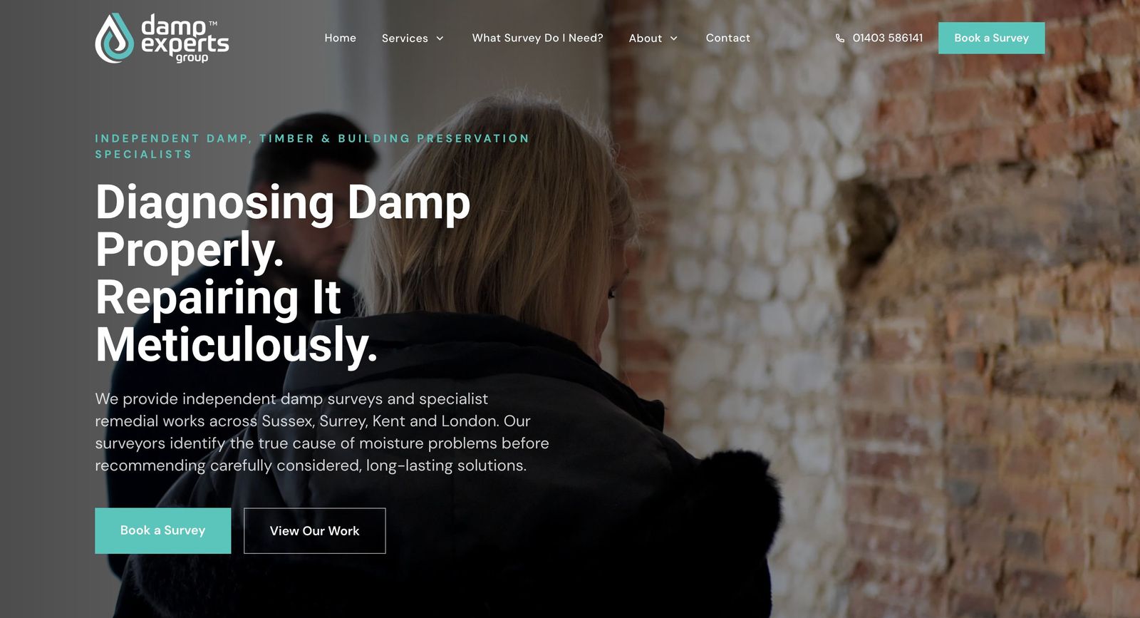
What do you do? Who is it for? Why does it matter? What happens next? A stranger should get all four within moments of arriving, in words a customer would use rather than words an industry uses. If your headline could sit on a competitor’s site unchanged, it is not answering the questions.
Match the Promise That Brought the Visitor
Every visitor arrives carrying a promise: the search result they clicked, the advert, the social post, the recommendation. The page must answer that promise. A visitor who searched for a specific service and lands on a generic homepage has to start again and most will not. This is why landing-page choice matters as much as landing-page quality.
Information Hierarchy: Important Things First
Put what matters where attention goes: the offer and next step early, supporting detail as the visitor scrolls and edge-case information where those who need it can find it. Motion and decoration are welcome only while they serve meaning: anything that hides content, delays understanding or exists to be admired is working against the page.
Trust and Proof, the Honest Kind
Trust is built from checkable things: real work shown, named people, documented scope on case studies, reviews with sources you can capture and performance evidence only where it is verified. Unverifiable superlatives lower trust with exactly the visitors worth winning, because sceptical buyers are the ones with money on the line.
Original Photography and Video
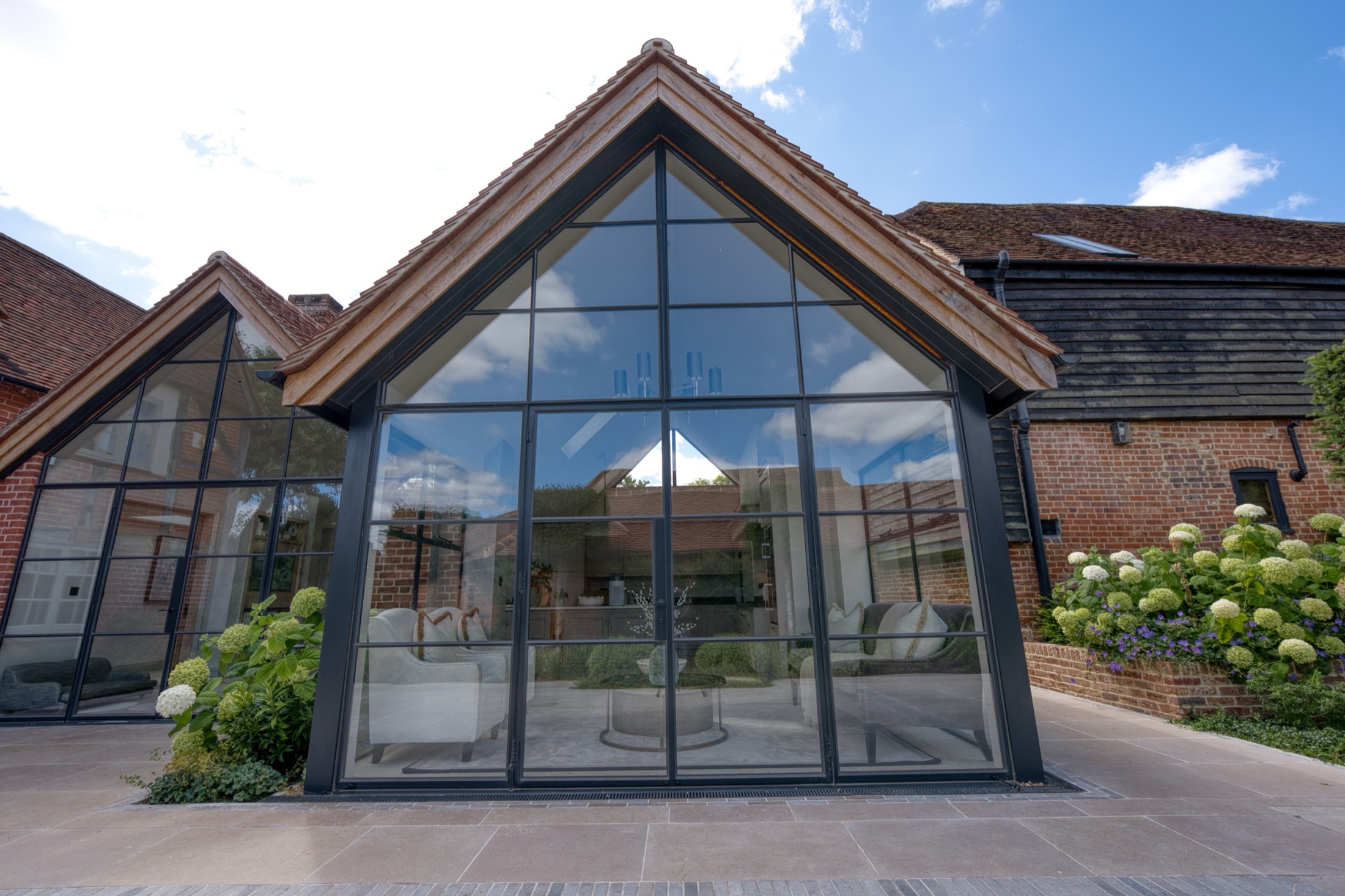
The value of original imagery is what it shows: your actual people, premises, work and customer experience, the things a visitor is trying to verify before contacting you. That is a differentiation argument, not a rankings claim: there is no automatic penalty for stock or generated imagery. The commercial problem is simpler, because pictures anyone could use cannot prove anything about you.
Calls to Action for Different Levels of Readiness
Not every visitor is ready to fill in a big enquiry form and pages that force that single choice lose everyone else. Offer suitable steps for different readiness levels: a direct enquiry route for the ready, a call or question route for the nearly-ready and something useful for the not-yet-ready. The mistake is not having a strong call to action, it is having only one.
Forms and Enquiry Journeys
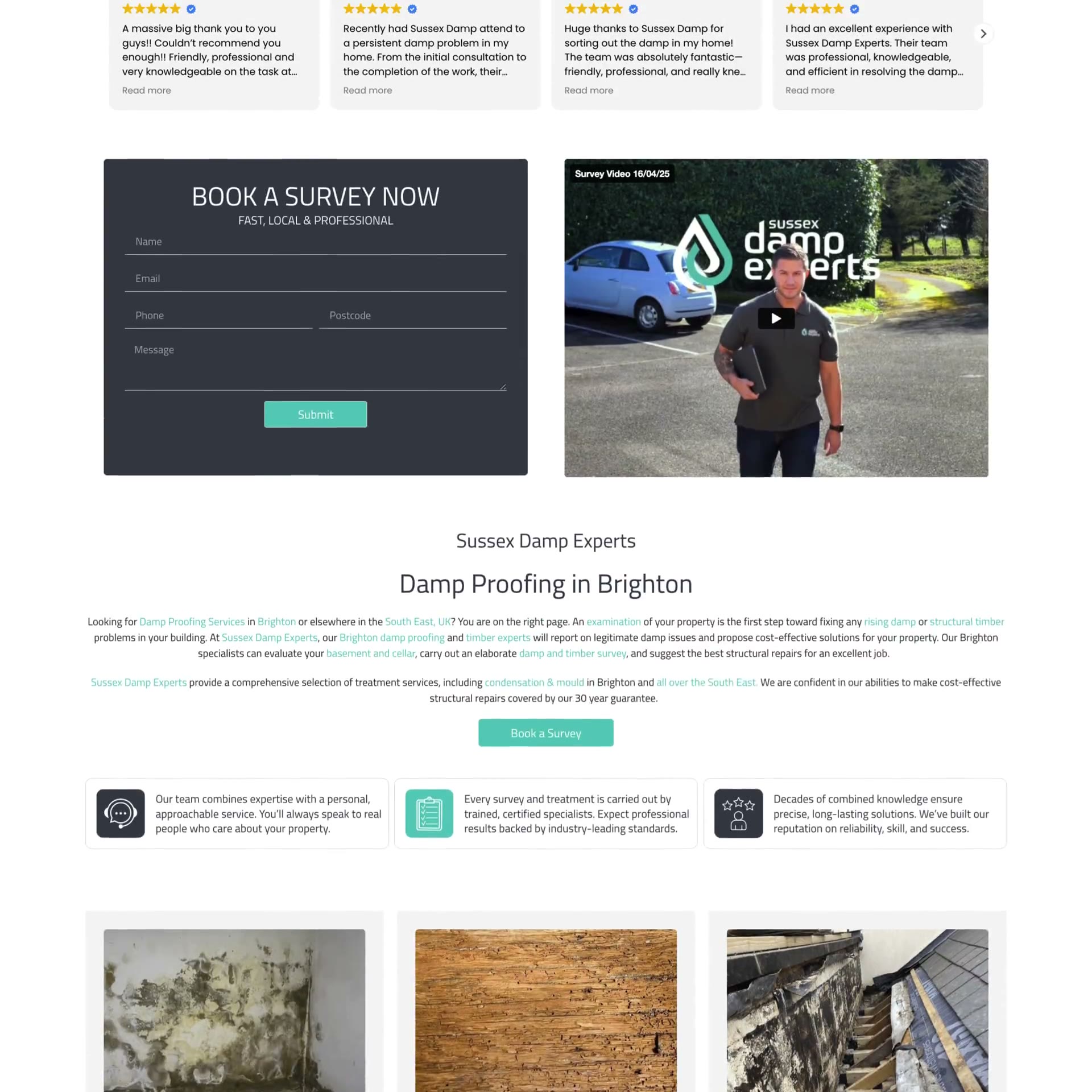
Ask only for what you will use. Label every field properly. Preserve context so a visitor who arrived from a specific service is not treated as a stranger. And test real delivery: a success message proves the page showed a message, not that the enquiry arrived anywhere. The only proof is a real submission received at the real destination, re-checked whenever anything changes.
The Mobile Experience Is the Experience
For most local businesses, most visitors arrive on a phone. Readable text without zooming, controls a thumb can use, tap targets that do not require precision and no essential interaction that only works with a mouse. If the mobile page frustrates, the desktop page’s elegance never gets seen.
Performance and Accessibility, Without Theatre
Fast-enough pages and accessible foundations are conversion work: readable contrast, keyboard-usable controls, sensible structure, images that do not bloat the page. Be wary of invented speed thresholds, perfect-score promises and legal-certification claims: the honest standard is doing the work, checking it on real devices and being straight about what any audit can and cannot certify.
What Happens After the Visitor Presses Send
Conversion does not end at the form. Someone must own the enquiry, respond properly and record the outcome where the business can see it, which is where a CRM earns its keep. A website cannot compensate for an unmanaged inbox and some of the best conversion work available to most businesses is fixing what happens after submission.
Measuring Conversion Honestly
Keep five numbers separate: visits, behaviour on the page, enquiries, qualified enquiries and sales. Understand the limits: consent choices affect tracking, phone and offline journeys leak, attribution is never perfect and missing data should be reported as missing rather than smoothed over. A measurement you cannot trust is worse than none, because it feels like knowledge.
Responsible Experimentation
Improve pages the grown-up way: form a hypothesis about a specific visitor problem, change one thing deliberately, agree in advance what would count as better and give the change a fair period. Generic claims that a button colour or a single trick lifts conversions are folklore; your page, your visitors and your measurement are the only experiment that counts.
The Problems We See Most Often
Vague headlines that could belong to anyone. Proof buried below the fold or missing entirely. Landing pages that ignore the promise of the ad or search result. Too many competing choices. A mobile experience nobody senior has used. Forms that were never tested end to end. And assumptions, everywhere, that nobody has checked against a real visitor in months.
A Page Review You Can Run Yourself
Open your most important page on your phone and ask: could a stranger say what we do, for whom and why it matters, within a few seconds of honest reading? Does the page answer the promise that brings visitors to it? Is the proof real and checkable? Is there a suitable next step for someone not ready to buy? Has the form’s delivery been tested recently, to a real inbox? Does anyone own what happens after submission? Any “no” is your highest-value fix and none of them requires buying anything.
Quick Answers
What makes a website convert?
The right visitor quickly understanding the offer, trusting the business and taking a suitable next step without friction. Everything else on this page is detail in service of that sentence.
Does redesigning a website increase enquiries?
Sometimes and nobody can guarantee it. A redesign helps when it fixes the actual problems: clarity, proof, mobile experience, enquiry journeys. A prettier version of the same problems converts the same.
What is a good conversion rate?
There is no universal conversion-rate benchmark that applies reliably to every business, audience, page and enquiry journey. Comparisons are most useful when their sector, traffic source, action definition and measurement method are understood. The most dependable comparison remains your own page against its own past, measured consistently.
Do animations help or hurt conversion?
Motion helps when it directs attention and demonstrates; it hurts when it hides meaning, delays content or exists for its own sake. Judge every animation by what it does for understanding.
Where do we start?
Read how we approach website design, how to choose a website partner and how long a build honestly takes, see the work, request a free website review of your current site or talk to us.