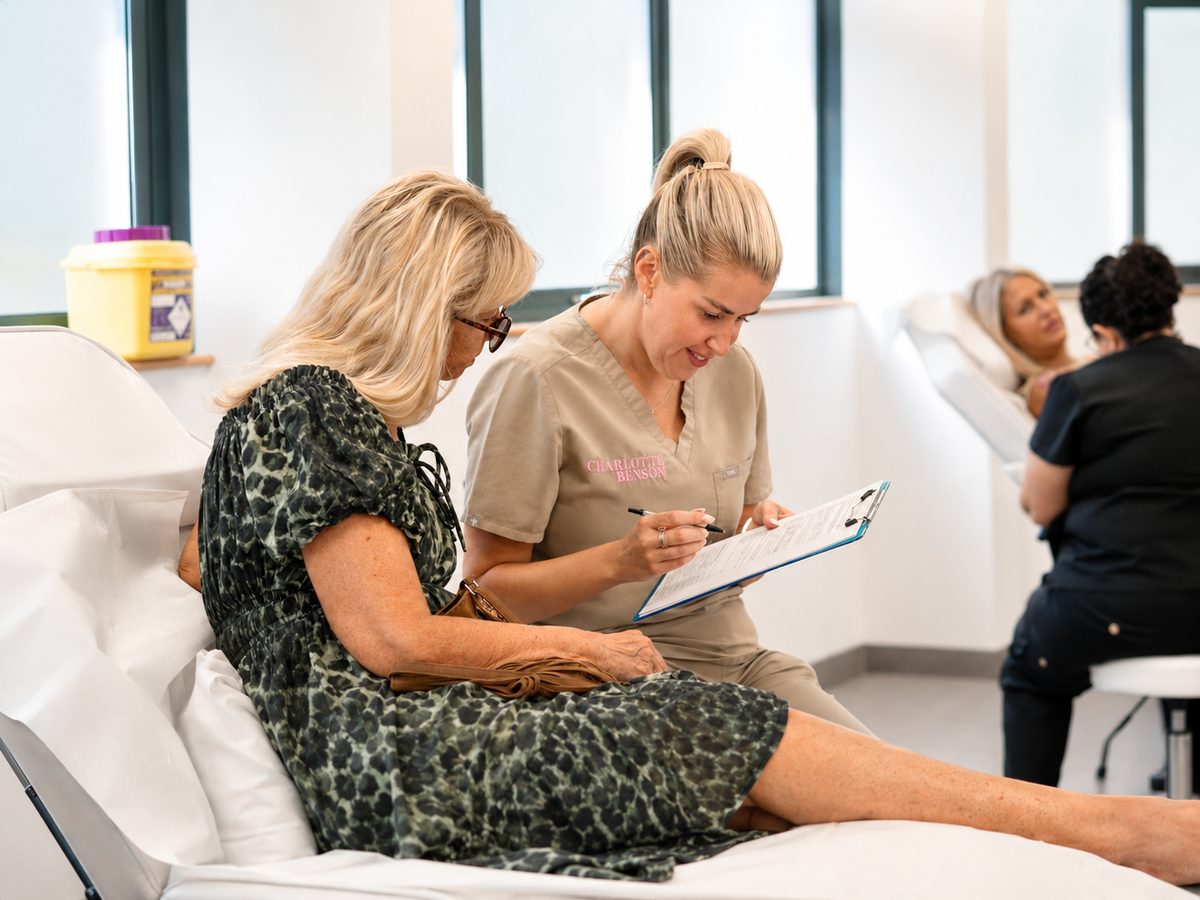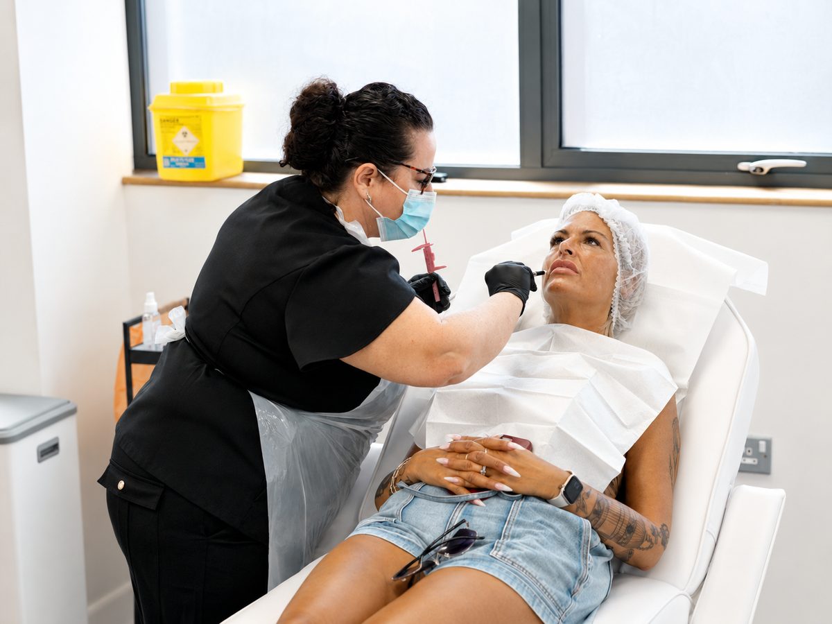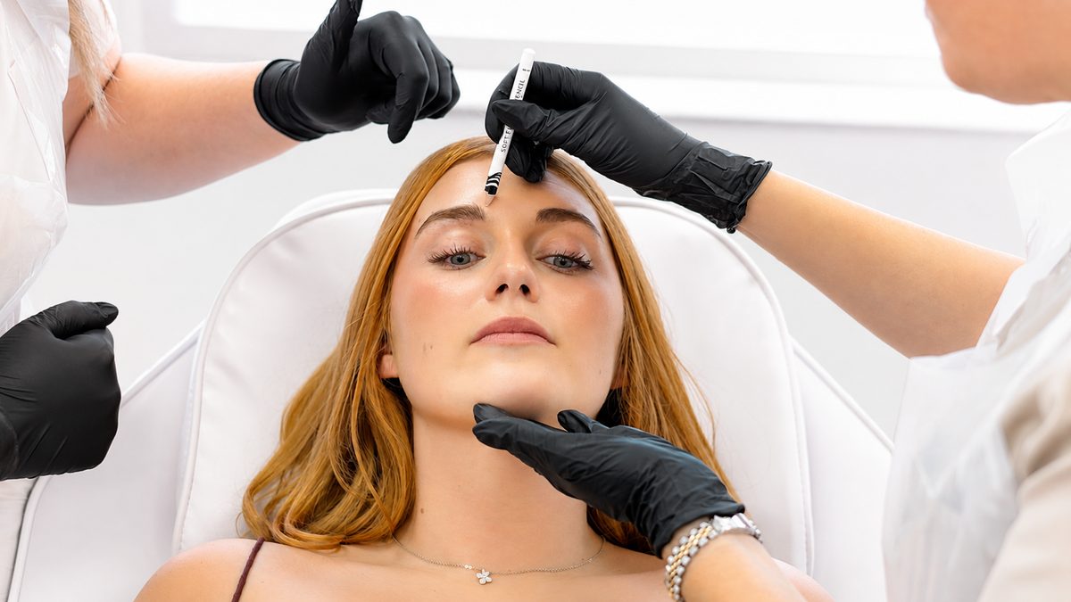
An Established Name Evolves
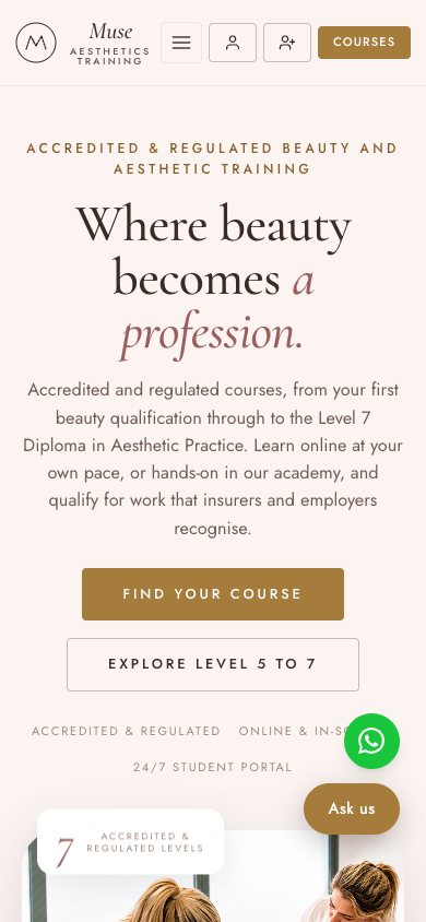
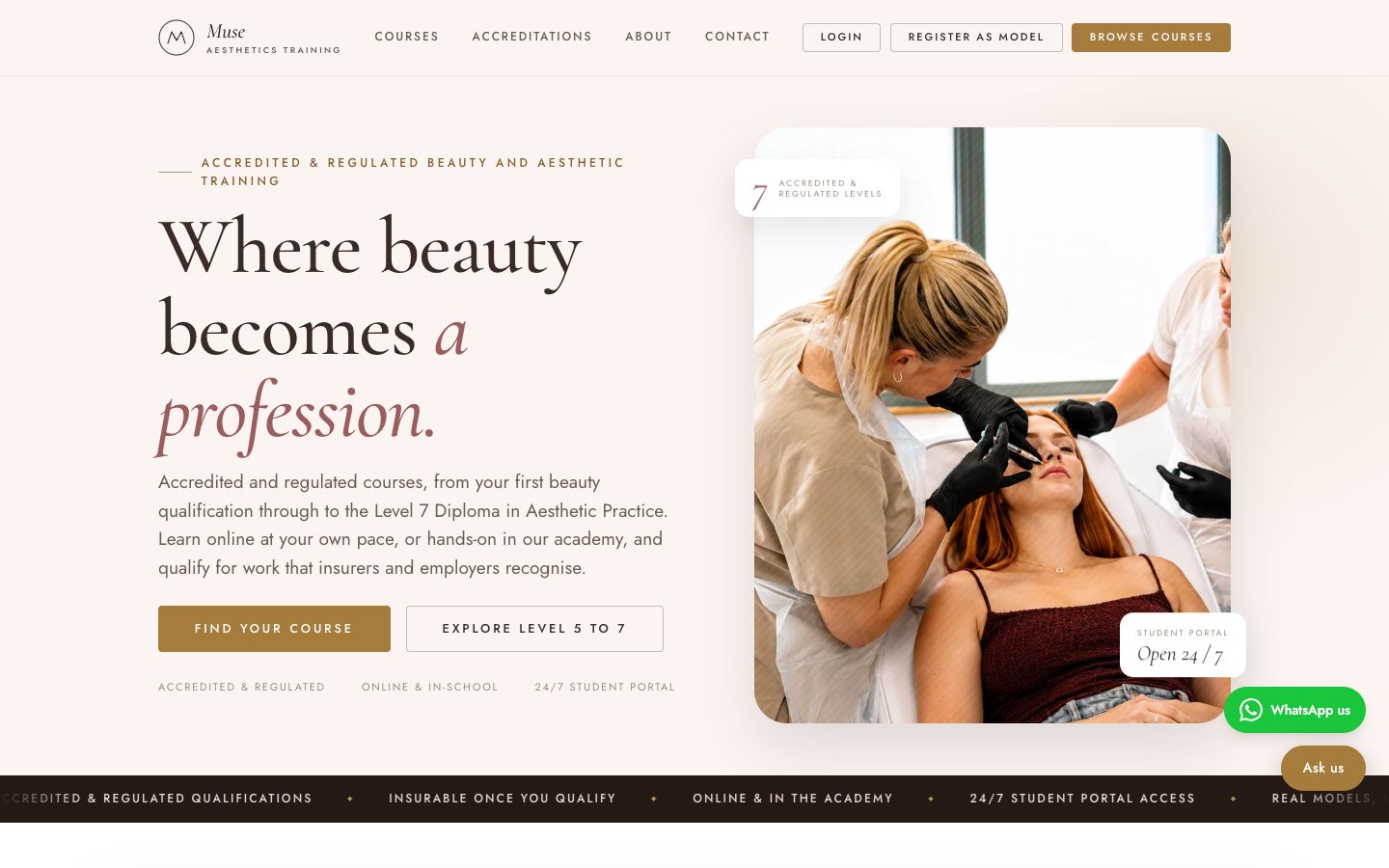
White Rose Training had years behind it. The founders wanted a fresh identity for the next chapter, and Muse Aesthetics Training was born. We ran the brand consultations, shaped the identity from the ground up and wrote the brand guidelines so everything stays consistent as Muse grows.
The new identity pairs an elegant serif, Cormorant Garamond, with a clean sans serif, Jost, on a palette of soft blush, deep clay and brass. The mark is a simple monogram: an M drawn as a peak inside a circle. Buttons have sharp, square corners, and the same type and colours run through every page, from course listings to the student portal.